<--- Previous article
Next article--->
15 descriptive design words you should know
Graphic Design, UX UI Design
January 30, 2014
Designers tend to pride themselves on being “visually oriented” — and rightly so. That need not mean that you can’t describe your wishes, however.
Being able to verbally describe your work to a designer throughout the feedback process is an indispensable skill. Here we’ve come up with fifteen very useful, high-level design words that any small business owner should have in his or her vocabulary.
Contour
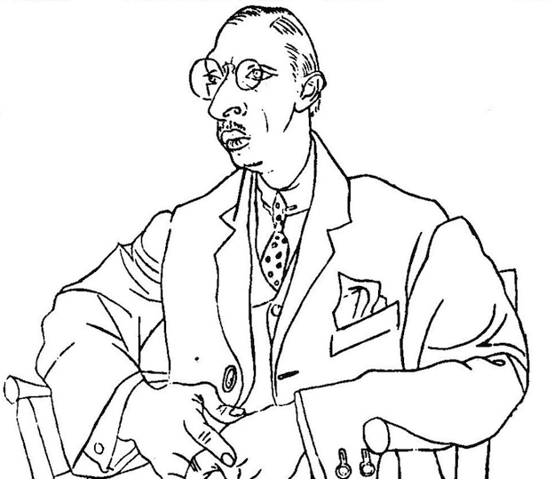
Picasso’s famous contour drawing of Igor Stravinsky
Basically another word for outline, but with a slightly more nuanced meaning. Whereas outline typically refers to the border between a drawn object and its environment, contour refers more to the shapes made by a 3D surface, which an artist can portray. For example, “the contours of her face.”
Curvilinear
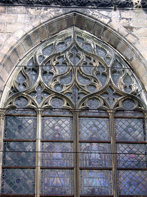
Curvilinear patterns on a Gothic cathedral window
Where a lay person says “curvy” or perhaps “flowy,” an artist says curvilinear — a reference to a shape bounded by curved rather than straight lines. The opposite, a shape consisting of parallel and perpendicular straight lines, is rectilinear. Forms that are curvilinear are also not angular, which implies straight lines meeting at sharp points.
Flush
An example of text that is flush left, ragged right
No, not as in “Royal” or “the toilet.” In design, flush refers to text that is perfectly aligned with the margin of a page, as in “flush left” or “flush with the right margin.” The other side of a flush text block is ragged. As a term for alignment, it is indispensable for any designer of editorial publications, packaging design, or anything else that involves copy.
Gestalt

This image illustrates a principle of gestalt psychology: we perceive a whole (a cube seen through holes) rather than a group of parts (8 circles with Y shapes in them).
Translating to “form” or “shape” in German, this is a psychology term that refers to one’s sense of the overall shape of something, which somehow exists as something more than just the sum of its parts. You could say of a design concept, “I have a gestalt in mind, but I haven’t worked out the details yet.”
Kerned

Three different kernings of the word “WAR” in Clarendon typeface
Kerning is key for typography lovers. It refers to the spacing between letters, or characters, in a line of text. In most typefaces, each letter is kerned differently so they nestle into one another in a pleasing and legible way. In a monospace font, however, there is an equal amount of space between each letter. When a tagline is shorter than a headline, it is common to widely kern the tagline’s characters so it matches the headline’s length.
Monochrome

A monochrome tapestry
People sometimes believe, incorrectly, that monochrome means “black and white.” In fact, the proper design word for that is grayscale. Monochrome simply means “one color” — could be any hue. The opposite of monochrome is variegated, meaning there are a variety of colors present.
Motif

A paisley motif on a Persian rug
This word is special in that it pervades most all forms of art. There are musical motifs, literary motifs and, in our case, design motifs. In each case, it refers to an important and repeated element. Ornamental patterns typically contain some sort of motif, like a spiral or floral arrangement, that appears repeatedly at intervals. Borrowing directly from the world of music, one could say that such patterns have a certain rhythm.
Muted
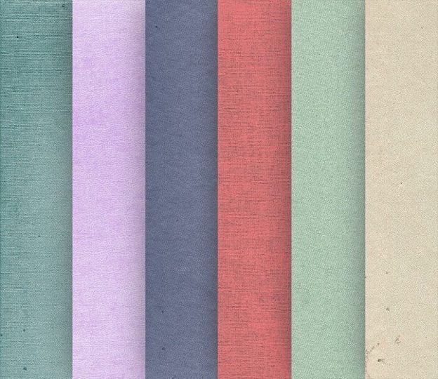
Muted pastels
As with sound, muted refers to colors that are in some way softened or dimmed; to be precise, rendered less bright, often by the addition of their complementary colors. The opposite of muted would be bright, vivid or vibrant. The juxtaposition of bright colors can yield high contrast, whereas the juxtaposition of muted colors would yield low contrast.
Negative Space
WWF‘s iconic logo makes strategic use of negative space
Negative Space, referring to the empty space between design objects, is certainly a prized term among designers. Some designers use negative space to create “secret” messages, like the right-pointing arrow between the “E” and the “x” in FedEx. Even when it is not being put to such clever purposes, though, the amount of negative space allowed importantly impacts the proportion of a design.
Radial

Metal work in a radial configuration
The root word radius (as in the radius of a circle) should give you a clue as to what this word means: lines radiating (there it is again) from a common center. Sun ray patterns are a common motif in retro-style designs, but the lines in a radial pattern need not be straight.
Skeuomorphic

Apple’s old iBooks app utilized skeuomorphic design to resemble a physical bookshelf
We swear, no one knew this word even existed prior to the flat vs. skeuomorphic UX design debates of the past year or so. As opposed to flat designs, which are minimal, skeuomorphic designs attempt to mimic the 3D look of physical objects beyond the screen through the use of trompe l’oeil effects like beveling, gradients anddrop shadows.
Structured

OCAD University’s logo is based on a highly structured form, upon which it can add a variety of more irregular flourishes
People use this word to describe designs that are strongly geometrical, usually based on straight lines, standard proportions and symmetry. The opposite quality would be amorphous (literally “shapeless,” though this word has a more negative connotation).
Tangent

Line PL is tangent to circle O
Geometry review! Whereas parallel lines never meet and perpendicular lines intersect, tangent lines touch a curve at a single point but do not cross. Once you know the word, you’ll begin seeing tangents everywhere in graphic design – and that’s not just referring to the rants that design bloggers go on!
Tertiary

The color wheel, demonstrating primary, secondary and tertiary colors
Things are often ordered as primary (first level), secondary (second level) and tertiary (third level). In graphic design, these terms mostly appear with respect to the color wheel, where Red, Yellow and Blue are primary colors (cannot be created through mixture of any other colors) and Green, Purple and Orange are secondary colors (they are the result of combining two primary colors). Tertiary colors, like yellow-green, yellow-orange and orange-red, are the result of combining secondary colors. Any of the above has its complementary color, which is the one opposite on the color wheel.
Translucent

Apple’s iOS7 uses translucent screens to create a sense of depth
Whereas a transparent plane (like a window) allows both light and images to pass through, and an opaqueplane (like a board of wood) allows neither, a translucent plane (like frosted glass) allows light but not well-defined images to pass through. This term wasn’t always a core part of a designer’s vocabulary, but now that designs like Apple’s iOS7 are making use of translucent screens more frequently, it certainly ought to be.